Module 1 · Chapter 4 · Lesson
Join, Reshape and Visualise
Join summaries with validated keys, expose unsampled combinations and communicate one comparison in a clear scientific figure.
Open this lesson in the Academy workspaceLearning pathway
You already know
Lesson 10 produced summary tables whose populations, denominators and composition were audited. These are derived evidence products with defined row meanings, not interchangeable tables that may be combined by position.
In this lesson
You will declare and validate entity relationships before joining, preserve unmatched keys and unsampled combinations, and turn an audited summary into an accessible figure whose caption carries the analytical contract.
Why this comes now
Communication requires structural transformation, but joins and pivots can silently change entity counts. A figure should be created only after the transformed evidence reconciles with its sources.
You will use this later
Lesson 12 integrates the table, figure and audit as one portfolio handover. Module 2 uses the same cardinality, alignment and communication principles for spatial joins, raster–vector extraction and map products.
1. Structure evidence for comparison and communication
Learning outcome
By the end of this lesson, you will be able to join two derived summaries with a validated key, reshape grouped results into a comparison matrix, and create a labelled scientific figure whose caption states population and limitations. You will add a publication-ready exploratory output to the Vegetation Data Explorer.
Prerequisites: Complete Lessons 1–10. You should be able to select, filter, group and summarise pandas data. Allow 100–120 minutes.
Why this matters
Scientific results rarely stay in the structure in which they were recorded. Site metadata may need to be joined to observations; long tables may need to become matrices for comparison; numerical summaries need figures that reveal patterns without overstating certainty.
Every structural change creates risk. A many-to-many join can duplicate observations. A pivot can hide unsampled combinations. A chart can imply a unit or comparison the data do not support. Professional workflow design makes keys, row counts and missing combinations visible.
Scientific context
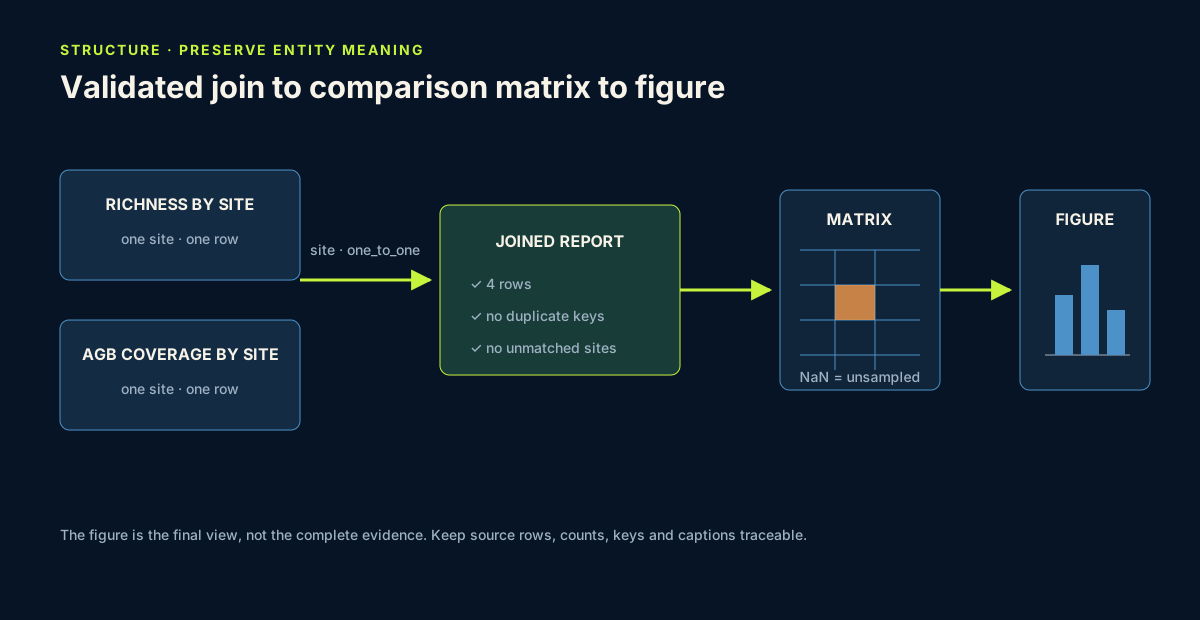
You will derive two site-level tables from the same published dataset: a species-richness summary and an above-ground biomass coverage summary. Their shared key is the exact site label. You will join them to show how descriptive richness results sit beside unequal biomass availability.
Core idea: join, reshape and visualise are three views of the same evidence; every view must preserve keys, denominators and missing combinations.
Learner action
Add ## Lesson 11 — Join, reshape and visualise. Write the intended row meaning of your final site report: “one row represents …”.
Declare the join contract
| Contract element | Site-report decision | Failure evidence |
|---|---|---|
| left row meaning | one richness summary per exact site label | duplicate left key |
| right row meaning | one AGB-coverage summary per exact site label | duplicate right key |
| key meaning | the same documented site entity in both tables | spelling or semantic mismatch |
| expected cardinality | one-to-one | validated merge raises an error |
| expected coverage | all four site keys on both sides | left-only or right-only key |
| expected result | four site rows, no multiplication | changed or duplicated row count |
Similar column names are not evidence of shared entity meaning. Write the contract before calling merge.
2. Join only after confirming the key
Worked example
Predict how many rows the final report should have:
richness_by_site = (
    meadows.groupby("site", observed=True)
    .agg(
        richness_n=("Sp_richness", "count"),
        richness_mean=("Sp_richness", "mean"),
    )
    .reset_index()
)
agb_by_site = (
    meadows.groupby("site", observed=True)
    .agg(
        total_rows=("SampleID", "size"),
        agb_n=("AGB", "count"),
    )
    .reset_index()
)
agb_by_site["agb_available_pct"] = 100 * agb_by_site["agb_n"] / agb_by_site["total_rows"]
site_report = richness_by_site.merge(agb_by_site, on="site", validate="one_to_one")
print(site_report.round(2))
The joined result should contain four rows—one for each site. validate="one_to_one" asks pandas to raise an error if either summary contains duplicate site keys. That failure would be useful evidence that the row meaning is not what you expected.
Code walkthrough
- Each group operation produces one row per site.
countcounts present values;sizecounts rows, including missing values..reset_index()turns the group label into an ordinary join column.- Availability percentage retains the denominator explicitly.
.merge(..., on="site")matches rows with the same exact site label.- Join validation protects the intended one-site-per-row relationship.
- The result combines evidence without changing the raw
meadowstable.
3. Audit a join before trusting its values
For every join, record:
- the row meaning of the left and right tables;
- the key fields and whether they should be unique;
- row count before and after;
- unmatched keys from both sides;
- expected relationship: one-to-one, one-to-many or many-to-one.
left_only = set(richness_by_site["site"]) - set(agb_by_site["site"])
right_only = set(agb_by_site["site"]) - set(richness_by_site["site"])

print("Rows before:", len(richness_by_site), len(agb_by_site))
print("Rows after:", len(site_report))
print("Unmatched left keys:", sorted(left_only))
print("Unmatched right keys:", sorted(right_only))
Never use a join merely because the columns have similar names. A scientifically meaningful key identifies the same entity under the same definition in both tables.
The worked merge uses pandas' default inner join, which would omit unmatched keys. Because you calculate both key differences first, that loss cannot remain silent. For a handover audit, also create an outer merge with indicator=True and inspect the _merge column before selecting the final join type.
Assert that both source keys are unique, both unmatched-key sets are empty, the result has four rows and the result key remains unique.
4. Reshape to expose sampled and unsampled combinations
Create a site-by-community matrix of mean species richness:
richness_matrix = meadows.pivot_table(
    index="site",
    columns="plantcommunity",
    values="Sp_richness",
    aggfunc="mean",
    observed=True,
)

print(richness_matrix.round(2))
The source table is long: each row is one quadrat, and grouping labels repeat. The matrix is wide: one axis is site, the other is community code, and each populated cell is a mean.
Empty matrix cells are important. They show site–community combinations not represented in the table, not zero richness. Do not fill them with zero for appearance. The matrix is useful for pattern inspection but no longer contains individual plot variation or sample size, so keep a companion count matrix.
count_matrix = meadows.pivot_table(
    index="site",
    columns="plantcommunity",
    values="SampleID",
    aggfunc="nunique",
    observed=True,
)
print(count_matrix)
Assert that mean and count matrices have identical index and column labels. For every populated mean cell, the companion count must be positive; for every unsampled combination, retain missingness in both views.
5. Design a figure that answers one question
Create a horizontal bar chart of site mean species richness:
import matplotlib.pyplot as plt

plot_data = site_report.sort_values("richness_mean")
ax = plot_data.plot.barh(
    x="site",
    y="richness_mean",
    color="#1f5f8b",
    legend=False,
)
ax.set_xlabel("Mean species richness per quadrat")
ax.set_ylabel("Site")
ax.set_title("Observed species richness by Baltic coastal wetland site")
ax.bar_label(ax.containers[0], fmt="%.1f", padding=3)
plt.tight_layout()
plt.show()
A professional exploratory figure includes:
- a title describing the comparison, not announcing a conclusion;
- axis labels that identify variable and statistical summary;
- units when confirmed by metadata;
- readable ordering and sufficient contrast;
- no unnecessary three-dimensional effects or decorative imagery;
- a caption stating source, analysis population, sample sizes, missing-value rule and interpretation limits.
Your caption should note that site row counts differ and site is not independent of sampled community composition. A bar height is not uncertainty. If you later add error bars, state exactly what they represent and whether assumptions are appropriate.
Save the final figure to a named outputs folder in both PNG and SVG form, then reopen both files. Record filename, purpose, creation date, source table and caption. PNG supports convenient preview; SVG preserves vector text and geometry. Neither export validates the underlying analysis.
Provide a concise text alternative describing the comparison, strongest visible pattern and main limitation. Do not rely on colour alone to distinguish categories, and check that labels remain readable at the size used in the Academy portfolio.
6. Common mistakes and recovery
Joining on row position
Recognition: two tables are placed side by side because they have the same length. Fix: join on a documented entity key and validate the relationship.
Allowing a many-to-many merge accidentally
Recognition: row count multiplies and summaries change. Fix: check key uniqueness and use validate to encode the expected relationship.
Filling unsampled pivot cells with zero
Recognition: the matrix appears complete but invents zero-valued observations. Fix: preserve NaN and explain that the combination was not represented.
Showing means without counts
Recognition: a figure makes groups look equally supported. Fix: include n in caption, annotation or companion table.
Using a figure as decoration
Recognition: colour and shape dominate while the analytical question is unclear. Fix: choose the simplest plot that reveals the comparison and remove elements that carry no information.
Claiming cause from the chart
Recognition: bars are described as effects of site. Fix: describe observed group differences and identify design or modelling needed for causal inference.
7. Guided practice — audit and improve the site figure
- Add
n_plotslabels to the site report. - Confirm that every site appears once and no join keys are unmatched.
- Create the richness mean and count matrices.
- Identify all unsampled site–community combinations.
- Produce the horizontal bar chart.
- Write a 100–140 word caption containing DOI, population, group sizes, summary statistic and two limitations.
- Ask a peer or use your own checklist: can the figure be understood without reading the code?
8. Independent challenge, reflection and portfolio artifact
Create a second figure for either Height_median or CCI_CWM by plant-community code.
- Build a summary table with
n, mean, median and standard deviation. - Join it to a present-value coverage table and validate the key.
- Sort groups intentionally.
- Choose a bar, dot or box plot and justify the choice.
- Use exact community codes without invented expansions.
- Write an accessible caption and a 150-word interpretation.
- Compare what the figure reveals with what the table preserves.
Professional communication decision
Classify the joined figure package as:
ready for portfolio handoverwhen cardinality, unmatched keys, row counts, pivot alignment, denominators, exports, caption and text alternative pass review;reviewwhen presentation is readable but a relationship or limitation is unclear;stopwhen a join multiplies or drops entities, an unsampled cell becomes zero or the figure cannot be traced to the audited summary.
Answer in private notes:
- What entity does your join key identify?
- How would you detect row multiplication?
- What does an empty pivot cell mean here?
- Which information belongs in the caption rather than the chart marks?
- Why can a visually correct chart still be based on a structurally invalid join?
Submission
- Notebook: validated join, audit output, pivot and count matrices, guided figure, independent figure and captions.
- Screenshot: one final figure together with its caption.
- Written answer: 250–350 words defending join key, reshape, chart choice and interpretation limits.
Portfolio artifact
Artifact 11 — Audited scientific summary and figure
This eleventh checkpoint in Portfolio Project 1 — Vegetation Data Explorer demonstrates that you can restructure evidence without losing entity meaning and communicate a real ecological comparison in traceable, accessible formats.
Where this goes next
Joining plots, species and trait medians requires explicit keys and cardinality checks: SampleID identifies the plot, while the reconciled taxon key links an original study label to an accepted FinBIF taxon. Reshaping does not repair an uncertain taxonomic match. Inspect the study-to-taxon evidence on a species page.